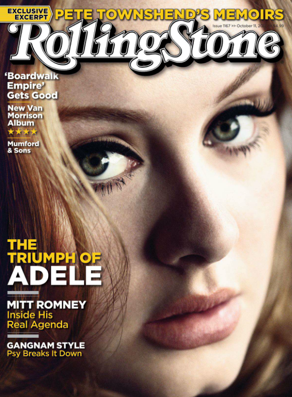
Rolling Stone, usually a magazine that is not afraid to hide parts of the masthead, has decided to place the title in front of the main image. Using an iconic figure in the music industry such as Adele, Rolling Stone will draw in readers to this popular artist, increasing their target audience. A close up shot has been used of Adele's face with an engaging expression that creates interest and grabs immediate attention; the masthead is therefore required to be placed in the foreground so it is easily visible and one of the first things we see.
It is apparent in this front cover that the main colours used are yellow, white, and brown. These simple colours keep the magazine looking light hearted and clean, whilst remaining appealing to the eye. As for text, Rolling Stone has chosen simple, readable text fonts that are conveniently placed prominently to the left side of the magazine as to be noticeable when the magazine is looked at with the z-read.
Furthermore, capitalisation is present in the form of article titles and artist names, which helps sell the magazine's key features and stands out against the other text. Popular artists have been included in this particular issue to increase interest, such as Mumford & Sons, and Adele.

Looking at the contents page, I can see that the theme is completely different. New colours of red and black have been used to highlight certain features of the page and make it more interesting to look at. The layout is simple and methodical, with all text placed horizontally against a plain white background which makes it easy to read, an important aspect of a contents page.
Quotes and key page numbers are included to highlight certain articles, however this does not allow for all pages to be shown, which may confuse some people and it does not show a conventional magazine contents page. To continue, a large image has been placed on the right hand side of the page of an interesting figure to sell the magazine's features and make the consumers want to look at the specific page.
Overall, Rolling Stone has created a simple but well thought out contents page that provides necessary information whilst remaining readable.

For this double page spread on Adele, a large image has been used that covers more than half of the page. This striking image will capture the reader's attention straight away and invites them to read this interesting article. A simple title in black offers a brief overview of what is included in the next couple of pages; the readable font shows the idea that text can be interesting and informative at the same time.


It is also apparent, looking at the next double page spread, that a theme of black and white has been continuously used throughout this article. From this I believe that the writers of Rolling Stone are trying to portray Adele with authenticity and elegance; with any other artist this could be regarded as a colour scheme that does not engage with the reader's, however it easily works with Adele and her classy music. An intriguing quote has been highlighted on the left hand page to sell certain aspects of the article and persuade fans of Adele to read on. Lastly, a second black and white image has been used to show Adele in the process of recording, which will relate to the readers of this magazine and show this artist as an authentic musician.
As my first deconstruction of a contents page and double page spread, I am pleased that I can come away with information and ideas to incorporate into my own music magazine that will hopefully capture certain features of the ones above.
No comments:
Post a Comment